Ranking the 2025 Tour de France jerseys: Something old, something new and lots of blue
You've scrutinised the route, analysed the form of the contenders, and weighed the relative quality of the various team line-ups against one another. What's left to do, but rate the jerseys of the Tour de France? Fashion expert Grace Coppola casts her judgement on all 23 kits - which team will come out on top in the style GC?

Twenty-three teams will be at the Grand Départ in Lille for the 2025 Tour de France, and we all know what’ll be on the rider’s minds. Not the upcoming 21 days, as arduous as they are an adventure, not the route and its important corners, and certainly not carb intake or staying hydrated. Obviously, they’re thinking about whether they’re in a banging kit or not.
The riders at the Tour de France may be fast, but the fashion isn’t. Five teams are packing special edition kits for the occasion, and one is Visma’s staple changeout kit. Red Bull-Bora-Hansgrohe have also treated us with an exclusive jersey, presumably just out of their love of the kit game, and so have UAE, Israel Premier-Tech, and Groupama FDJ.
Let’s take a closer look at what makes the twenty-three team jerseys good, bad, and ugly.
Tour de France Femmes jerseys
Grace Coppola judged also the 2025 Tour de France Femmes jerseys. You want to know her favourite? Read all about it here.
Alpecin-Deceuninck
Alpecin-Deceuninck have been riding in their 'Dark Denim' kit for over a year now, announced for the 2024 Tour, and will pack it again in 2025. But should they? The shampoo claimed last year to create a 'fresher, more youthful look', so why are we still riding around in this sad old kit? The jersey was developed to advertise the Alpecin ‘Grey Attack’ shampoo, and supposedly joins the fight against grey hair, aging, and the progression of time, telling 'a heroic story, that shows that it is worth fighting and never giving up – even in the battle against time.' Sure. But like, that’s ridiculous. Genuinely one of the oddest sponsorship moments in recent memory.
Jasper Philipsen broke a 109-day drought with a win at the Baloise Belgium Tour, and I can’t help but wonder whether this has something to do with the kit. Is the grey attack taking over its host? Alpecin should come up with a different kit for the Tour de France, just to be sure. Or even bring back the blue denim. It was a lot, but it was fun, an unlikely texture, a surreal trick on the eye, and of course so 2001 Britney and Justin, or, if you prefer, Bruce Springsteen in the '80s.
Rating: 2/10
Arkéa-B&B Hotels
Given all their sponsorship troubles it feels awful to go too hard on Arkéa-B&B Hotels. Lucky for me, there’s nothing to be hard on. Their 2025 kit is a classic Arkéa kit, a simple and effective combination of a red body, black sleeves, and white lettering and accents. Completely inoffensive and, most helpfully, identifiable in the bunch. It’s this kind of reliable, solid colour design that dominated cycling through the 1960s and '70s. If it ain’t broke!
Rating: 6/10
Bahrain-Victorious
Team Bahrain Victorious’ 2025 kit is the 'same fresh look' as their 2024 jersey, which follows from a 2023 special edition Tour de France kit, where they first pivoted from the red look they’d had since their inception to this snowy white number.
Bahrain’s 2025 kit, like their 2023 kit, is stooped in symbolism. Those luminescent teal accents represent the shallow waters of the Arabian Gulf that grow the pearls Bahrain is renowned for, and supply a historic pearling industry which forms a large part of the country’s cultural bedrock. And how wonderful is it to ponder local Bahraini traditions, as you watch a race through France, from wherever you are in the world?
Teal and bright white reminiscent of this rich history continues to form the basis of the 2025 kit. The jersey is also kept clear, cool, and smooth as a pearl by keeping the motley of teal logos firmly within the body of the jersey. Teal accents on the sleeves, complementing these logos, harmonises the jersey as well. Bahrain’s jersey achieves a bright, understated look while balancing a dozen logos and honouring centuries old traditions.
Rating: 7/10
Cofidis
It is my humble, personal opinion that a cycling kit should never evoke McDonald’s, unless you’ve managed to secure a very lucrative sponsorship deal.
I also believe that you shouldn’t pair a mustard yellow with a maroon, and then definitely not with a hot red, and then not when the black accent colours on your sleeves are a different colour to the Cofidis logo positioned vertically down the body of your jersey. And it should absolutely not be in such a blunt singlet shape. This jersey just features too many competing elements, when any of them might work as the main event. I do love the look of a vertical logo, but not with these colours, or that singlet shape.
Rating: 4/10
Decathlon-AG2R La Mondiale Team
Let’s try not to go on about the beloved/ugly brown shorts of yore. This jersey is the only team jersey to feature so delightfully personal a touch as coordinates to their offices in La Motte-Servolex, France (45°36'08.9"N, 5°53'01.2"E). The saturated shades of mint and teal on asymmetric sleeves also are a treat for the eye, and the body of the jersey is coloured with flowing deep blue plumes that evoke the deep sea. Light, thin lines that flow out from the collar and down the length of the body also create a delicate, subtle silhouette.
Decathlon’s 2025 jersey is a reappraisal of their 2024 design, ditching the gimmicky space graphic for something more serene and refined. Btw, they should bring back the brown shorts as a 2025 special edition kit, just an idea - sending a request to their coordinates as provided.
Rating: 8/10
EF Education-EasyPost
The 2025 EF Education Easy-Post jersey is just sumptuous. Their signature vivid pink and a glimmering gradient, an argyle pattern decorated with regal emblems, and silver diamonds dotted across the body and sleeves. As EF put it, 'our new look celebrates the grit and guile of EF Pro Cycling athletes as diamonds forged under pressure'. This jersey is just so cool, so bold, so fun, and so beautifully and consciously designed as a testament to EF riders. Adapting seamlessly into a white version for the 2025 Giro d’Italia, we’re so excited to see this kit back in all its glory in France.
Rating: 9/10
Groupama-FDJ
Groupama-FDJ are bringing a new jersey to the Tour, after having the same design since 2023. The new design is comprised of a marina blue body that gradates to a deep blue towards the base of the jersey, leading seamlessly and beautifully into blue shorts. The body also includes lighter blue shapes on the chest, making it glimmer, as well as complementing the white logos in the centre of the chest. The jersey also features an audacious, bright red sleeve that contrasts both the colour and subtle layers in the body. Overall, a mellow, diaphanous jersey that packs an unexpected, welcome punch.
Rating: 7/10
INEOS Grenadiers
While the INEOS Grenadiers have secured their off-bike looks with a swanky new deal with Adidas, it’s TotalEnergies that’re making a new mark on INEOS’s 2025 Tour de France kit. And oh boy does it make a mark. They’ve just smacked that TotalEnergies logo right on there. This is exactly how not to incorporate a new logo onto an existing kit, there’s absolutely zero effort to redesign and integrate TotalEnergies’ rainbow and white based logo onto the red and black INEOS kit. You can’t just add a white accent onto a sleeve and hope that makes everything cohesive, and it definitely doesn’t offset the giant white band. I’m such a big fan of the standard 2025 INEOS design, which utilises a black to light orange gradient vertically across the jersey, and sets the body of the jersey in the team’s signature red. It’s a simple, effective, and fiery jersey that shows you can do a whole lot with just a little. And now, totally ruined!
This is what happens when management informs a design team that they’ve secured a new sponsor a few weeks before the biggest month in cycling.
Rating: 1/10
Intermarché-Wanty
The 2025 Intermarché kit is a transformation of their cool 2024 design, which featured an assortment of asymmetric quadrilaterals in a striking colour combination, fluoro yellow and midnight blue, plus red accents, on a white base.
The 2025 kit revamps this colour combination, first established in 2018 (may I also here give a shoutout to the 2021 Intermarché–Wanty–Gobert Matériaux kit, one of my all-time favourites), upgrading the red from accent colour to a primary, alongside the yellow and blue. The new ménage à trois borders a busy array of logos from top to bottom of the jersey, which I’m choosing to interpret as a positive sign of years of brand interest in cycling to come.
It’s not the greatest kit, more utilitarian about fitting in all those logos than design-forward, but it’s not bad.
Rating: 5/10
Israel-Premier Tech
Israel-Premier Tech have also revealed a new jersey for the 2025 Tour. The jersey is their usual shade of blue with the addition of magenta on one sleeve and embellished with a purple cubic pattern on the sleeves and body. The result is a jersey that’s gaudy but lacking in drama or ingenuity. Though perhaps more visible in the bunch, this jersey, still blue and lacking originality, doesn’t succeed in standing out.
Rating: 4/10
Lidl-Trek
Lidl-Trek has hands down one of the best jerseys in the peloton. The way the Lidl logo is embraced and taken as the basis of the design is an impressively ingenious design choice, turning a loud, friendly and familiar supermarket logo into a bold, unmistakable jersey. The dynamic diagonals and bright saturated colours are perfectly suited to a cycling jersey, and the decision to crop the design at the chest is a very chic, modern touch that ensures the design isn’t exhausted (imagine it over the whole body, would be a bit much). Though not a new design, this jersey will be fresh throughout the 2025 Tour.
Rating: 9/10
Lotto
Lotto Cycling Team opened the 2025 season with a jersey that celebrated Lotto’s 40th year in cycling, because the best way to get back at a departing sponsor is to loudly love the one you got. For the 2025 Tour, Lotto is continuing the festivities with a new jersey highlighting 15 years with Caps Energy Card, which makes me wonder, can you hard launch a relationship you’ve had for 15 years?
The 2025 Tour jersey adds the Caps logo to the standing 2025 kit, a red number with a retro use of white lines along the seams connecting the sleeves to the body (these seams are often hidden in contemporary jerseys) and a distinct collar. Gradients on the sleeves and body progress in opposite directions, brightening the chest area, which is complemented by diagonal lines in the bottom of the jersey, adding more dynamism and visual interest. This is a balanced, cohesive jersey design, which - thankfully - the new logo stabilises rather than throws out of balance.
Rating: 7/10
Movistar Team
Since 2022 the Movistar team has alternated each year between navy blue and white kits. 2025 is, of course, a white kit year. This kit features a large, dark blue box containing the Movistar logo on the chest, surrounded by a glitchy blue design that also accents the sleeves, forming a wide blue stripe across the chest and arms.
Limiting most of the textual glitchy graphics to a layer behind a dark box and giant ‘M’ I feel limits how interesting the jersey could be. But it’s an icy jersey with graphics not too often seen in the peloton, evoking the data driven approach the sport has embraced over the past few years.
Rating: 6/10
Red Bull-Bora-Hansgrohe
Red Bull-Bora-Hansgrohe unveiled a new jersey for the 2025 Tour! The special edition jersey is adorned with dozens of lines that angle over the entire body, every line rolling through all the colours of the rainbow. It’s a novel take on the rainbow trope, spinning the colours into parallel neon powerlines.
It’s a jersey audacious not in colour, but in the originality of the design. The pattern even lightens around the logos for maximum visibility. A super exciting special edition kit that’ll glow under the French sun.
Rating: 9/10
Soudal Quick-Step
Though they’re fresh off their sort-of 1000th win, Soudal is, sadly, not celebrating with another T-Rex jersey. Instead, their 2025 jersey evokes the flash of a cyclist speeding by, appropriate for the bike race which attracts the most spectators. Though, more sad news, the jersey’s a mess. It’s frumpy, crying out for structure, a distinct collar, a distinction between body and sleeve, cropping the design, something to break it up and prop up the shoulders. It’s a mess of blue, white, and red that compete with the Soudal logo for attention, and I didn’t even notice the Quick-step logo.
The back of the jersey is actually a far more organised, pared-back design that should’ve been repeated on the front. Plus, we really do have a lot of blue in this peloton, it can’t possibly be everyone’s signature colour, and everyone’s favourite secondary colour can’t possibly be white either.
Rating: 3/10
Team Jayco AlUla
Finally! Purple in the men’s peloton! A whole other colour that can be used! Jayco AlUla jerseys have been a treat these last two years (they had to make up for the 2021 BikeExchange kit) and we can’t wait to see this purple number debuted at the Tour de France. Bold in both colour and design, this jersey features a warped pattern in purple and black, green accents that contrast and pop, simple stand-out white lettering, and, last but not least, the most unconventional cycling shorts can get before they combust, grey. I honestly still can’t wrap my head around how indigo and grey work so well together, but they do.
While Jayco’s 2024 special edition Tour jersey celebrated the landscape and architecture of the ancient AlUla region, the story behind this jersey seems to be ‘look cooler than the rest of the peloton’, and that they do. This is how you do a signature colour combination and a spunky, modern jersey.
Rating: 9/10
Team Picnic PostNL
The Team Picnic PostNL kit can boast having the biggest shapes (the Picnic square and what is apparently called a 'reuleaux triangle' for PostNL, very fancy) and the biggest zipper lines of any jersey in the peloton. The deep indigo of this jersey harmonises calmly with the orange and reds of the logo and accents. The large shapes and deep colour give a sense of steadiness and dependability, and what more could you want from a cycling team or Dutch mail service? This jersey doesn’t bring the fun or excitement, but sometimes at the Tour de France what you really need is calm.
Rating: 6/10
Team TotalEnergies
Another day, another white jersey. The Team TotalEnergies jersey features a white base, a front and centre rainbow-coloured TotalEnergies logo, and small pastel tags to accent the base, sleeves, and collar of the jersey. These accents are just, and there’s no other way to put it, adorable. Like, was this kit inspired by some kind of confectionary wrapping? Unfortunately not, it’s just sportswashing, and it doesn’t quite evoke the fast-paced action of cycling.
Rating: 5/10
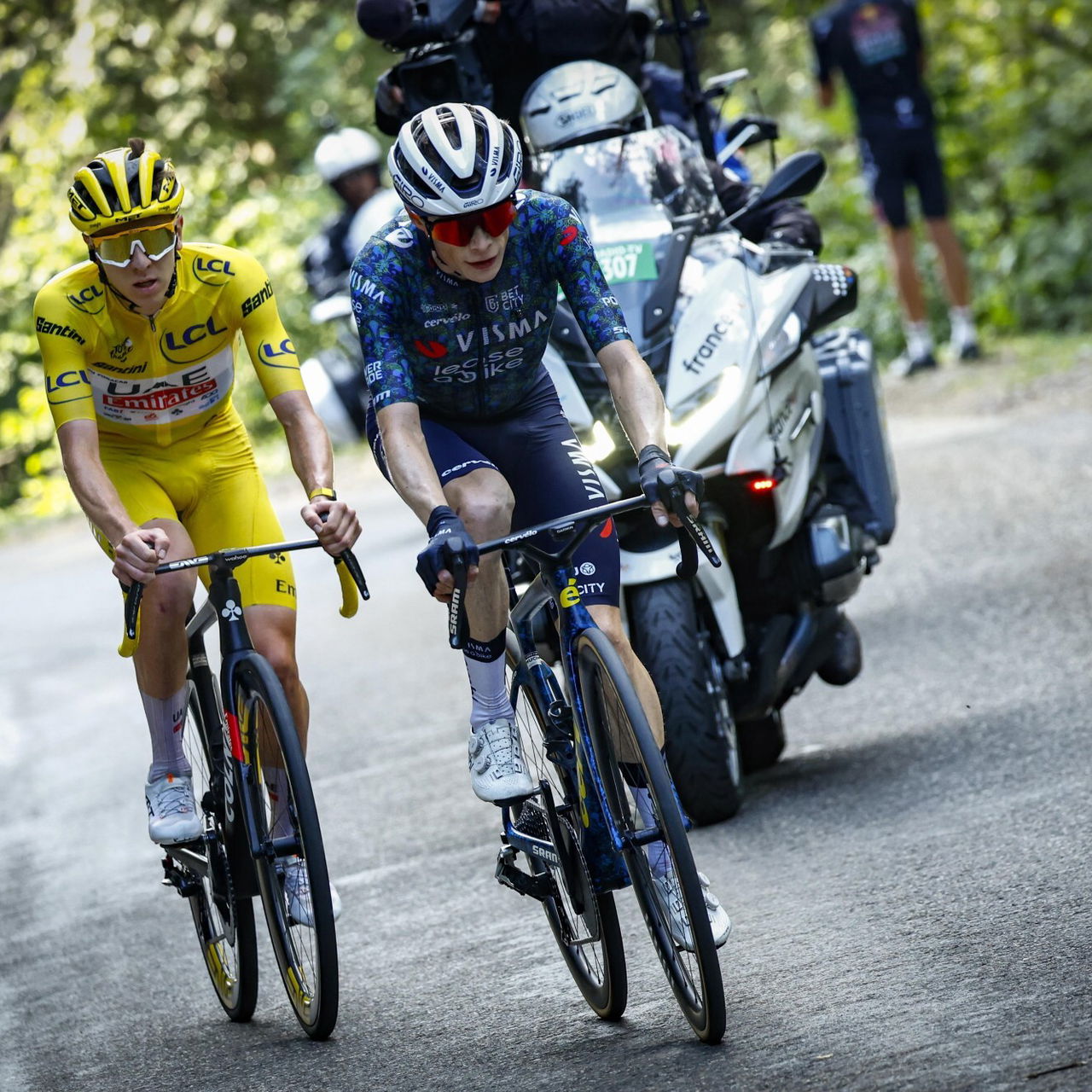
Team Visma | Lease a Bike
Visma | Lease a Bike couldn’t miss a marketing opportunity even if they tried. 'The Swarm', the team’s 2025 Tour de France jersey, continues the team’s bee-themed marketing push, and was announced with a video waxing poetic about bees and hives and swarms and collective strength. But it’s also a natural push for a team who have embraced yellow as their signature. The brand consciousness of the team also puts them well ahead of the rest of the peloton when it comes to connecting with fans (I’m surprised they haven’t started auctioning off dinners with their riders for charity). The team’s 2025 Tour de France jersey features the names of fans who pre-ordered the jerseys, and I think this is such a great, original idea, those fans must treasure them.
The actual jersey leaves a little to be desired, and I wish there was a more ingenious design to match to originality of the idea. One other feat of ingenuity though, as Bluesky user @goldbluebirdie.bsky.social has discovered, is that the jersey is still recognisably yellow from above.
Rating: 7/10
Tudor Pro Cycling Team
While Tudor announced a limited-edition version of their signature specialised cycling watch, the Pelagos FXD Chrono ‘Yellow’, to mark Fabian Cancellara’s return to the Tour de France as a team owner, the Tudor cycling team will stick with their tried-and-true kit for their Tour debut.
This jersey is a valiant monochrome black design with bold red accents, a reduced but absolutely striking design. The central emblem, the Tudor shield, transforms the jersey into a matching suit of armour, fit defences for these brave Tour hopefuls.
Rating: 7/10
UAE Team Emirates-XRG
UAE Team Emirates XRG are taking a special edition jersey with them to the 2025 Tour de France. Their 2025 standard has a crisp white chest and shoulders and, on the base and sleeves, black decorated with plumes of white dust or smoke. The stateliness of the glossy white chest feels undercut by the steaming, dirty vapours lingering on the edges of the jersey, it just looks kind of gross. The 2025 Tour kit embraces the dirt, earth, and air, overlaying the bright white with crackling mint green and mottled black, representing “the strength of nature with the lightness of the alpine air”.
I think this kit is a great improvement on the 2025 standard, subtler and more refined, the dirty smoke replaced by a gentler representation of nature spread over the whole jersey. The real question is, how does it look in yellow?
Rating: 6/10
Uno-X Mobility
Right off the bat, that black zipper line has got to go. Why have something so prominently overlap and intersect the logo? The jersey also has a basic, solid colour design with a pattern of triangles on the body that are so subtle I wonder why they’re even there. A solid red design would complement the solidity of the Uno-X logo and bold font much better, as in their 2024 jersey. I’ve got their spectacularly retro special edition Liège‑Bastogne‑Liège jersey open to cheer myself up. Could it please come back for one more epic day, pretty please?
Rating: 4/10
XDS Astana Team
Closing this review on a good note, I LOVE this kit. After the crystalline catastrophe of their 2024 kit, Astana’s new sponsor XDS must have brought a kicking design team with them. I love the sky blue overlayed with the thinnest, almost transparent lines, a good way to spice up a monochrome base that I haven’t seen in the peloton before. On the body, these lines are overlayed with other, wavy lines, forming a kind of moiré pattern that gives the jersey a sense of movement and depth. These wavy lines adorn the chest, and marble at the base of the jersey. More variation comes from splashes of neon pink and yellow lines overlayed on opposite shoulders and sleeves. The logo also matches well, with bold white lettering firmly outlined, to both harmonise with the lines covering the jersey, yet contrast enough to make the logo stand out.
Effective yet colourful, with a design that leads with lines in the most interesting way, I think this jersey deserves a lot more love.
Rating: 8/10
After writing this review, I’m left wondering, can you really love a team with a bad kit? And, have any sponsorships even been lost on account of an ugly kit? Most importantly, which kit is your favourite and why do you love it? Let us know!
Follow the 2025 Tour de France at Domestique
This overview is part of our Tour de France 2025 content hub. Explore all the features we've put together for you and enjoy the race!


